Photoshop is a wonderful tool to use once you are comfortable with digital photography. This tutorial will show you how to use Camera RAW to apply adjustments and enhancements to your photos. You will learn how to work with tone, colour balance, and understand what the main sliders do. Please note, that in order to achieve the best results in Camera RAW, you should work with a RAW file, not a JPEG.
Here is our starting image, shot on a weekend trip to Quebec City during the summer of 2020.

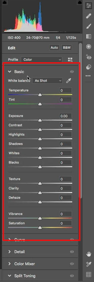
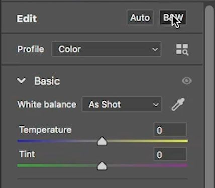
Change the image to black and white with the B&W button. This is not necessary, but it helps to see what is happening with the tones in the image without the distraction of colour.
Start with the Exposure to adjust the overall brightness. Then use the Shadow and Highlight sliders to recover details lost in the shadows and highlights. By moving the Shadow slider to the right, the shadows aren't as dark. Opposite for the Highlights, move the slider to the left, and the highlights aren't so bright. This allows us to see more details.

Click on B&W once again to bring the colour back. There is a noticeable difference already. Because we worked in black and white, we may need to adjust the Shadows and Highlights slightly to bring it to what we are looking for.
Now, perhaps there are some white areas that are a bit dull or overly bright. We can use the Whites slider to fix this. If you bring the slider to the left, you will lower the white point, and to the right would raise the white point. The same thing applies to the Blacks slider.
We've worked on the basic tone, now we will adjust the Texture, Clarity, and Dehaze. These sliders are the Presence sliders. Because it was a darker photo originally, there is a bit of graininess now that we have brought it back to brightness. We will tone this down slightly by adjusting the Texture to -5. To compensate this, increase the Clarity to add edge definition to avoid losing too much detail. Finally in this section, bump up the Dehaze slightly to increase contrast within the photo.

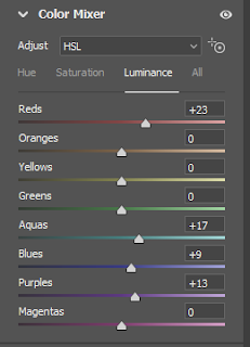
Now it's time for colour adjustments. Most of these are subjective to your preference. I personally like to make the unique colours in an image pop, but at the same time allow for the subject of the photo to stand out. Navigate down to the 'Color Mixer' tab, and ensure that HSL is selected. HSL stands for Hue, Saturation, and Luminance. Hue is the variety of a colour (i.e. reddish orange vs yellowish orange), saturation is the amount of colour, and luminance is the brightness within a colour.
I usually do not touch Hue, unless my image is shifting slightly in a different colour tone than I would like, so I begin with Saturation. I start focussing on the areas I want to stand out: the umbrellas, the trees scattered around, the purple flowers on the windowsill. That means increasing the blues, greens, and purples as necessary. Then adjust those elements that I want to blend into the background, such as the orange/yellow hue from inside the cafe, coming through the windows. This means decreasing the oranges and yellows. I also decreased the aquas, as once I brought up the blues, the logo on the umbrellas was too prominent for my liking.
Then we work with the Luminance. As mentioned, luminance is the brightness within a colour. In this case, I wanted to slightly the reds throughout the image (mainly to brighten the faces of my subjects), increase the aquas and blues (brighten the umbrellas), and brighten the purples (brighten the flowers).


0 comments